There are plenty of ways to visualize results from surveys and benchmarks. A classical one is a line plot of the Likert scale (i.e. Likert chart / plot). While it is a great chart type, it is a pity that Excel does not offer it out of the box.
There are manuals on the internet available on how to build a Likert chart with Excel. However, this post explains how to mass create multiple slides with Likert Charts with SlideFab for free. This can be useful in benchmarking surveys for example, where each participant shall receive a personalized result presentation.
UPDATE: There was a bug in the Excel model which led to incorrectly drawn charts. Thanks to Thomas Seitz from http://www.tsm-marktforschung.de/ for pointing this out. The example files was updated, cf. below.
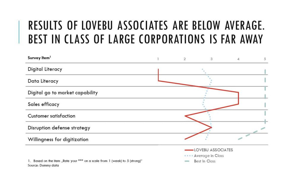
Typically, the Likert scala is used for survey items like “Please rate the following elements on a scale from 1 (disagreement) to 5 (agreement)” . Then it presents the elements like “Our company is strong at analytics”, “Our company is digitally adept”, etc. Likert Charts greatly show the differences between these elements. They help to visually compare multiple survey items at once. Moreover, Likert Charts also allows to simply add further lines, e.g. for “Best in Class” comparisons.
How to mass-create Powerpoint slides with personalized Likert Charts
1. Getting the survey result data
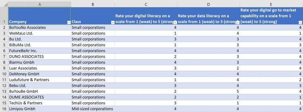
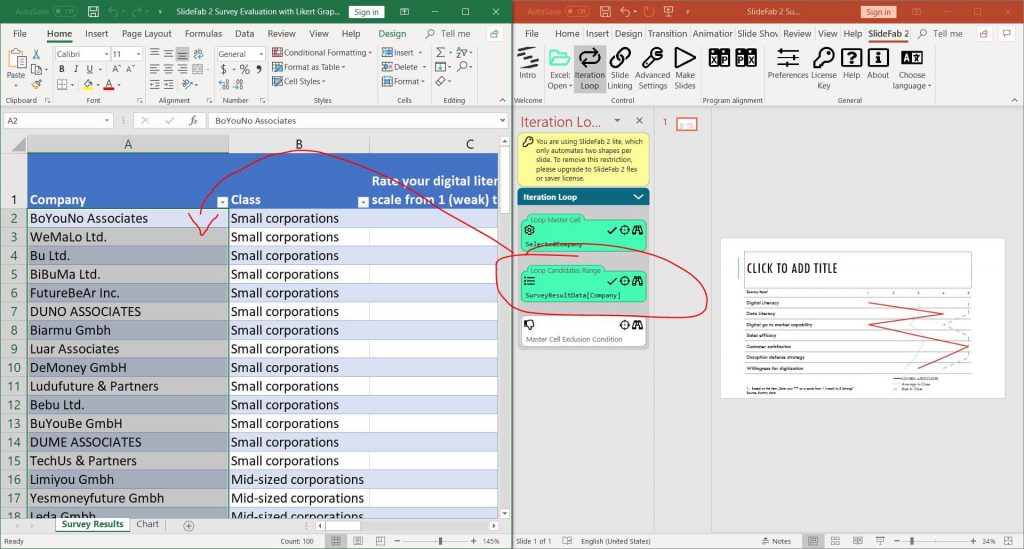
Many survey tools provide an Excel export option. This generates a file where all survey results are in one worksheet: The top row contains the survey items, the first column contains a participant identifier (here company name) and maybe some columns with cluster information (e.g. here class, which is about company size). At the intersection between columns and rows the answers can be found: Here values between 1 and 5.
2. Preparing the personalization
As this example is about companies, a personalized feedback slide for each companies shall be created. Thus, a single cell needs to hold the selected company name. This cell must not have a formula. Its contents will be overwritten with company names from SlideFab automatically.

3. Creating the chart calculation range
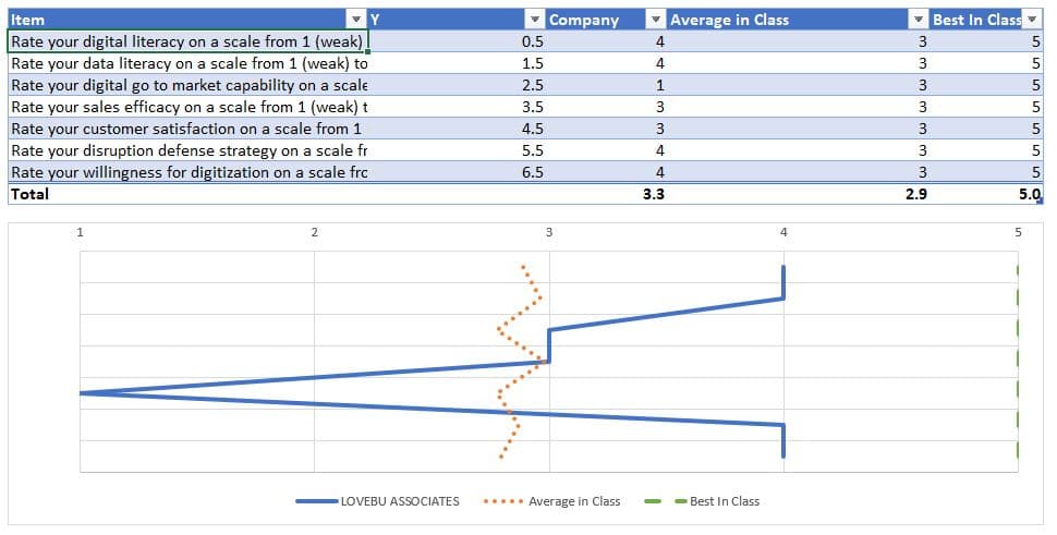
In order to give customized feedback the raw data needs to be brought into shape. For Likert Charts all items can be brought into a table. This table contains 5 columns:
- Item: Which is the item name
- Y: Y-Axis position
- Company: Result for the selected company (cf. above)
- Average in Class: Optional comparison values
- Best in Class: Optional comparison values
These columns allow it to create Likert Charts based on an Excel “Scatter with Straight Lines” chart. An explanation on how to do this can be found here or just look into the example file which can be downloaded below.
With the selected company (cf. above) the personalized data can be looked up using VLOOKUP or INDEX/MATCH. When the selected company changes, the output data range will be updated automatically.
4. Preparing the Powerpoint template file
When mass creating slides a template is required. The template for this Likert Charts example will contain three elements:
- A title shape
- A table containing the survey items (For the sake of simplicity in this example these items will be hard-coded. Creating a flexible one with looked up survey items one would be possible as well.
- The Likert Chart which is aligned to the table.
5. Setting up SlideFab for slide making automation
To set up SlideFab for this exercise two tasks have to be completed:
a) Linking Excel with Powerpoint through SlideFab
In this example only two elements will be automated. This means that this example is perfectly suited also for the free SlideFab lite edition.
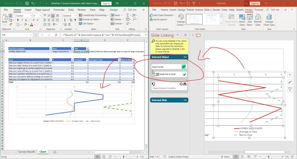
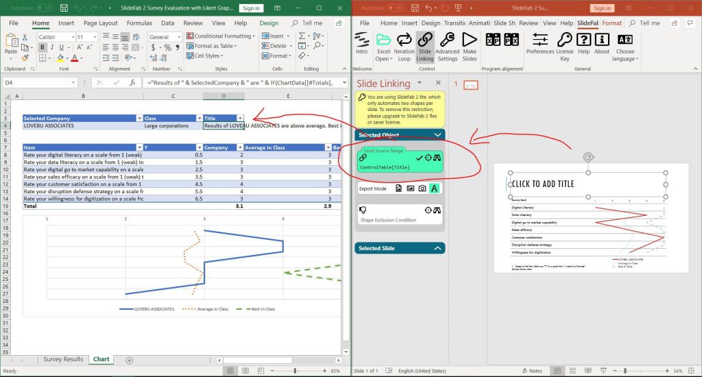
First of all, the chart title will be linked. Therefore the title shape needs to be clicked in Powerpoint. Then the Excel cell with the title needs to be clicked. Finally through clicking the crosshair icon, SlideFab links the cell to the shape.
Secondly, linking the chart is even easier: As this chart is an Excel chart copied and pasted as link to Powerpoint nothing has to be done. SlideFab will tick the box to break the link to Excel automatically. Otherwise the charts would be updated permanently, whenever the selected company changes.
b) Setting up the personalization loop through SlideFab
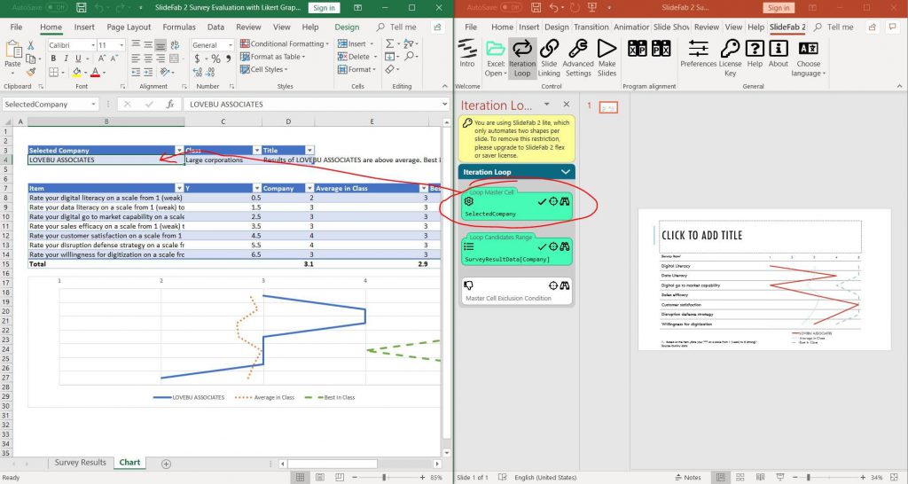
To mass-create personalized copies of the Likert chart SlideFab needs to know how. Therefor the “selected company” cell needs to be selected and the crosshair for the “Loop Master Cell” needs to be clicked. Now SlideFab knows that this cell needs to be altered. As the chart depends on the “selected company” cell, a personalization will be achieved.
To tell SlideFab for whom the personalization needs to be created the “Loop Candidates Range” needs to be filled. Therefor the range with the company names has to be selected and the crosshair needs to be clicked.
6. Start the Slide Making automation in SlideFab
As everything is set up now, it just necessary to start the SlideFab automation to mass create hundreds of slides with Likert Charts. This example here can be reproduced with the free SlideFab lite edition.
Please note: When there is a message from PowerPoint during the slide making process that it cannot find the linked file, this will help:
- In PowerPoint: Click File -> Information
- In the lower right click the link to show further details
- Click “Edit links to files” (don’t break the link)
- Click “Change Source”, select the Excel workbook and confirm.
Find here https://support.office.com/en-us/article/update-or-remove-a-broken-link-to-an-external-file-29485589-816e-4841-81b7-ff90ae5a2cc4 more information about links.
Looking for further simpler examples? Have a look at the Hello World example which contains building an Excel file, PowerPoint template and a SlideFab-based automation within three minutes.
